
Light Reading
Colour Temperature
Ask five people what colour temperature a room should be and you’ll get five answers, delivered with more confidence than the question deserves. That’s why people get anxious about it. Colour temperature is one of the few lighting decisions with no settled right answer. The room shows it the moment the power goes on, and nothing changes it afterwards short of changing fixtures.
Here’s what the number means, what it doesn’t, and how we pick one.
Where the scale comes from
In the late 1800s the physicist William Thomson, later Lord Kelvin, heated a block of carbon and watched it change colour as it got hotter: dim red, through orange and yellow, up to a bluish white. The temperature of the block became the way we describe the colour of the light, and the scale carries his name.
That history explains the one thing everybody trips over. A low number is warm and a high number is cool, which is the reverse of how the words behave everywhere else. The terms describe how the light feels, not how hot it is.
The numbers people actually specify
Manufacturers publish bands, but specifications land on a short list of discrete points:
- 2200 to 2400K. Candlelight. Used where the light is meant to be seen rather than seen by.
- 2700K. Warm white. The incandescent reference point, and the default in hospitality and residential.
- 3000K. Soft white. Still warm, slightly cleaner on whites and greys.
- 3500K. Neutral. The middle ground, common in offices and circulation.
- 4000K. Cool white. Task and workplace lighting.
- 5000K. Daylight. Inspection and security.
- 6500K. The cool end of the scale, and rare inside occupied space.
Anything between those points exists, but the standard offering clusters here, which matters when you need a replacement in five years.

Two things Kelvin is not
Kelvin is not brightness. This one is worth stating flatly, because it trips up people who do this for a living: 3000K tells you the colour of the light, not how much of it there is. That’s lumens. We’ve watched two professionals correct each other about it in the same thread.
The confusion is easy to make and expensive to act on. A room specified at 4000K because someone wanted it brighter will be exactly as bright as the same room at 3000K, and cooler. If you want more light, ask for more lumens.
Colour temperature is not colour quality
Colour temperature tells you what colour the light is. It tells you nothing about how good things look underneath it. Two fixtures can both be 3000K and make the same piece of walnut look completely different.
That second thing is CRI, short for colour rendering index. It’s a score out of 100 comparing the light against daylight, and it answers a simpler question than the name suggests: do things under this light look the colour they actually are? Under a poor one, reds go brown, wood goes flat, and people look a little grey.
80 is the ordinary commercial baseline. 90 and up is what you want anywhere colour matters — food, merchandise, artwork, wood, brick, and any room where people are being looked at. It’s a small line on a quote and one of the few upgrades you can see from across a room.
What warmer light actually costs
There is a common line that colour temperature and efficiency are unrelated. That’s not quite true, and the real numbers are more useful than the reassurance.
Producing warm white means converting more blue light down into the red end of the spectrum, and every conversion loses a little energy as heat. Across the usual range that puts colour temperature at roughly a five per cent swing in efficacy. CRI moves it about three times as much, in the region of fifteen per cent, because faithful reds demand a lot of long-wave output the eye is not very sensitive to.
So a 3000K 90 CRI product will draw more watts for the same light than a 5000K 80 CRI one. That is a real trade and usually the right one to make, because nobody has ever walked into a room and admired the efficacy. Know the size of it before an energy model comes back tighter than expected.
Checking it on site
Colour temperature is measurable, and on a job where the answer is disputed it’s worth measuring rather than arguing. A handheld colour meter reads it in seconds.
Two things decide whether the reading is worth anything. Hold the meter close to the source if you are testing the fixture, and hold it in the middle of the space if you are testing the room, because every surface the light has bounced off has already changed it. A warm oak floor and a white ceiling don’t hand back the same light they were given.
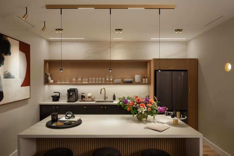
Choosing by room
Starting points, not rules. Every one of them should survive a mock-up before it is locked.
- Offices: 3500K. Neutral without going cold. 4000K gets specified in offices constantly and we do not recommend it — it reads clinical in a room people sit in all day, and nobody ever asked us to make an office feel more like a warehouse.
- Retail: around 3000K for apparel and anything where warmth flatters the goods; 4000K to 5000K for grocery and electronics. Specify 90+ CRI wherever the merchandise has a colour worth protecting.
- Healthcare: patient rooms 3000K to 3500K at 90 CRI, examination 3500K to 4000K, procedure spaces 4000K to 5000K.
- Hospitality: 2700K to 3000K, and lower still at the decorative layer.
- Industrial and warehouse: 4000K.
Age changes the answer
Here’s something you won’t often see written down. The lens of the eye yellows with age, so it filters out more of the blue end as people get older. An older occupant genuinely needs more light, and often prefers a cooler source, because it reads as brighter to them.
But it cuts both ways, and the people it affects say so themselves. Cooler light also scatters more inside the eye, so the same person who finds 5000K brighter can also find it harder to look at. More light, warmer source, better glare control is usually the better answer for an older room than simply going cooler.
It matters where you’d expect: seniors’ housing, healthcare, and any workplace where the age range is wide. Sample the light in front of the people who’ll live under it, rather than settling it in a meeting.
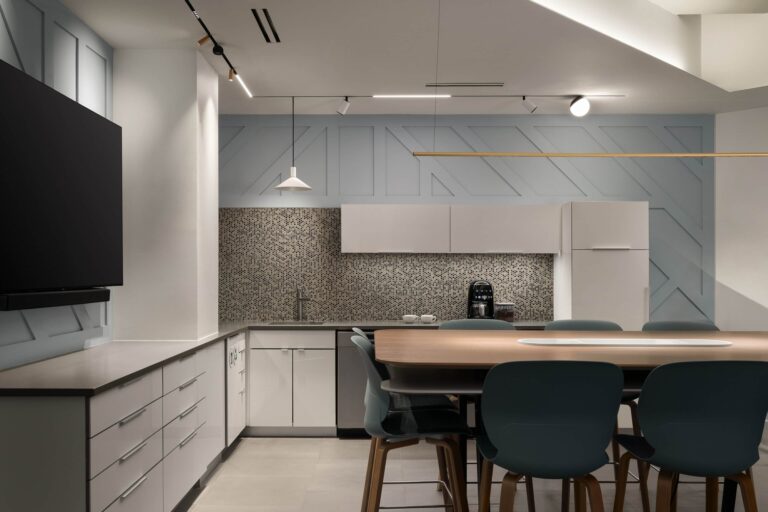
Consistency matters more than the number
A ceiling where every fixture is 3500K looks better than a ceiling where half are 3000K and half are 3500K, whichever you prefer on its own. Mixed colour temperature is the thing people notice without being able to name it.
It’s not only about picking one number. LEDs come off the line with small variations, and manufacturers sort them into batches by how close each one lands to the target. A tighter batch costs a little more, because fewer of them qualify.
So pick one colour temperature for the space, and ask your supplier to confirm the fixtures are coming from a tight batch. It costs nothing to ask, and once the ceiling is in, the only fix is new fixtures.
When one number is not enough
Some spaces want to move. Dim-to-warm products drop colour temperature as they dim, so a room falls towards candlelight the way an incandescent lamp used to. Tunable white separates the two, letting you hold output while shifting colour, which is what a space needs when it is a boardroom at nine and a reception at six.
The same technology sits underneath most circadian schemes, where colour temperature tracks the time of day. The research is still moving and we’d be cautious about promising a health outcome. What is not in question is that a room lit at 5000K at nine in the evening feels wrong to almost everyone in it.
If that’s the direction, look at Ketra, which is built around exactly this.

Common questions
What is the Kelvin scale?
It’s the scale used to describe how warm or cool a light source looks, written as a number followed by K. Lower numbers are warmer and more orange, higher numbers are cooler and bluer, which is the opposite of how people usually talk about hot and cold. Candlelight sits around 2000K, a domestic warm white around 2700K, and an overcast sky far above 6000K.
What colour temperature should I choose?
Warmer light, around 2700K to 3000K, suits the rooms people relax in and the ones where skin and wood need to look right. Neutral, around 3500K, suits offices, corridors and anywhere the work matters more than the mood; 4000K belongs in warehouses and industrial space rather than in a room people sit in all day. Cooler than that has a job in industrial and inspection spaces and very little to do in an occupied room.
Is warm light less efficient than cool light?
A little, and not enough to choose on. Across the range you’d actually specify, colour temperature moves efficiency by roughly five per cent. That’s a real trade and usually the right one to make, because nobody has ever walked into a room and admired the efficiency.
Why do two fixtures at the same colour temperature look different?
Because they came from different batches. LEDs come off the line with small variations and manufacturers sort them by how close each one lands to the target, so two fixtures on the same spec sheet can sit visibly apart on the same ceiling. Ask for a tight batch before the order goes in.
Can I mix colour temperatures in one building?
Between rooms, yes, and often you should — a warm lounge and a neutral open office is a deliberate choice, not an inconsistency. Within a single sightline, no. The eye forgives a difference it walks between and never forgives one it can see all at once.
Keep reading
- How to Select Downlights — spacing, beam angle, glare, and the difference between damp and wet ratings.
- How Lighting Affects How a Room Feels — what the research supports, and what it does not.
Don’t miss out on Flux updates, promos and other news. Sign up for our newsletter here.